Digital signage & style
HiQ Communications, QUT
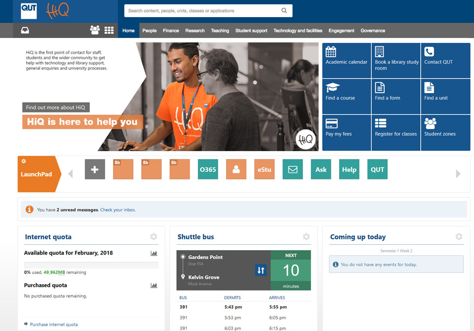
Building a visual language is just as important as cultivating tone when responding to student enquiries. Introducing strong visuals across all student facing digital media galvanised the HiQ Communications identity at QUT.
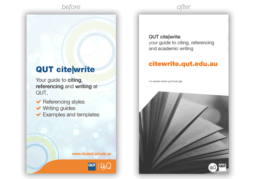
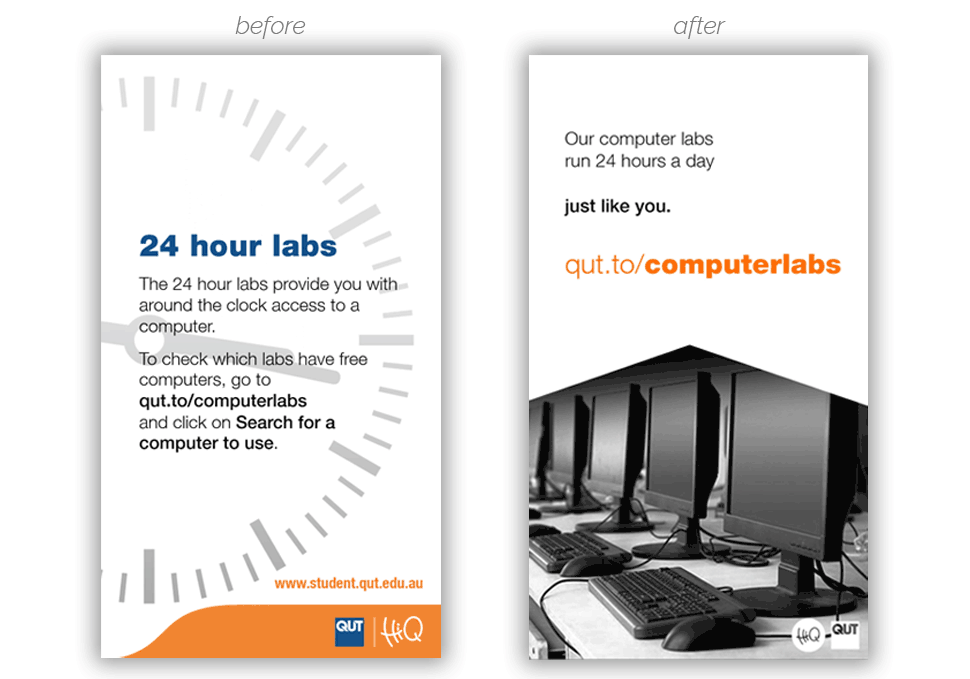
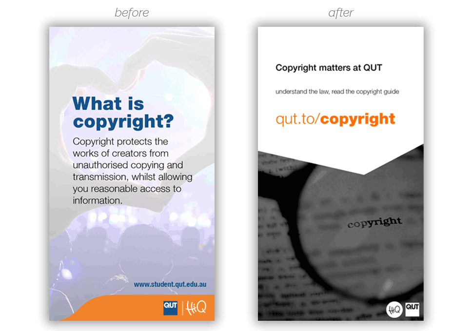
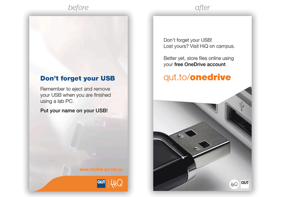
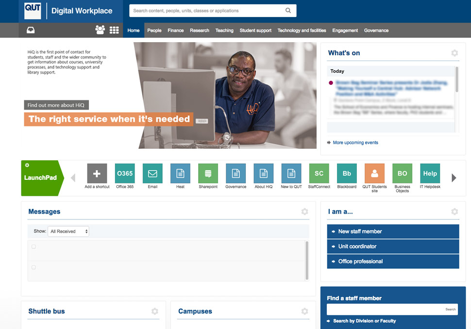
Before HiQ launched, all materials were created in line with QUT's existing corporate identity and style guide. This was an effective measuring stick for content, but it was aesthetically limiting. The launch of QUT's student services model HiQ brought a new identity, style guide and sensibilities to the table. It allowed designers working in this space to experiment with colours and styles in a new way.
Any design freedom is exciting, but I was more interested in cultivating a visual language for HiQ. How could I ensure students know a message is from HiQ? How could I use look and feel to create a visuals that complement HiQ's conversational tone? How will this fit with other QUT publications?
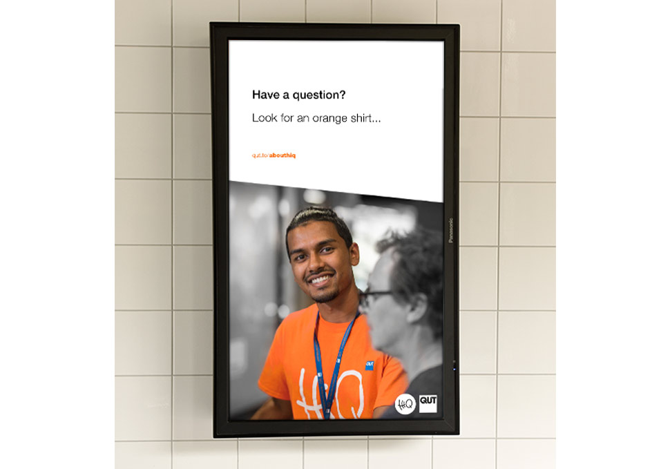
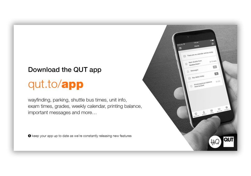
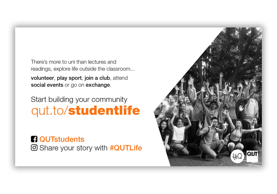
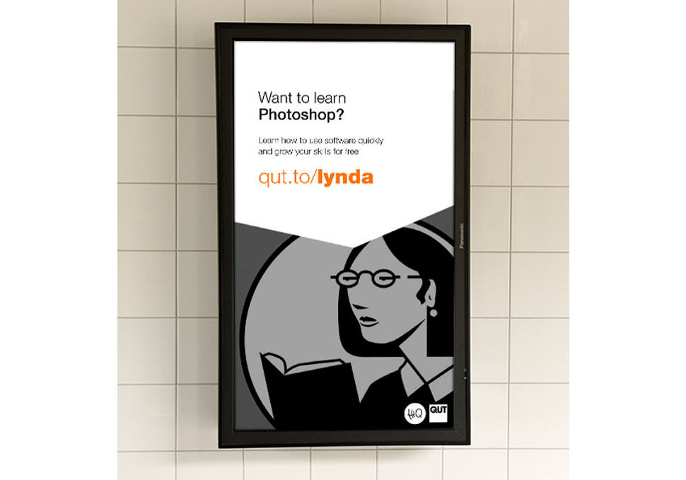
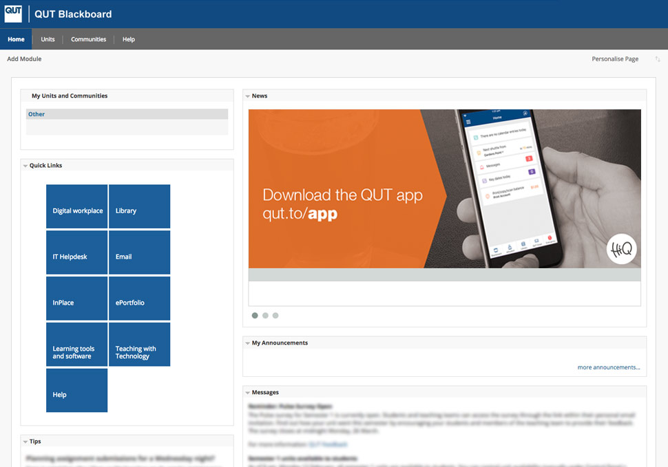
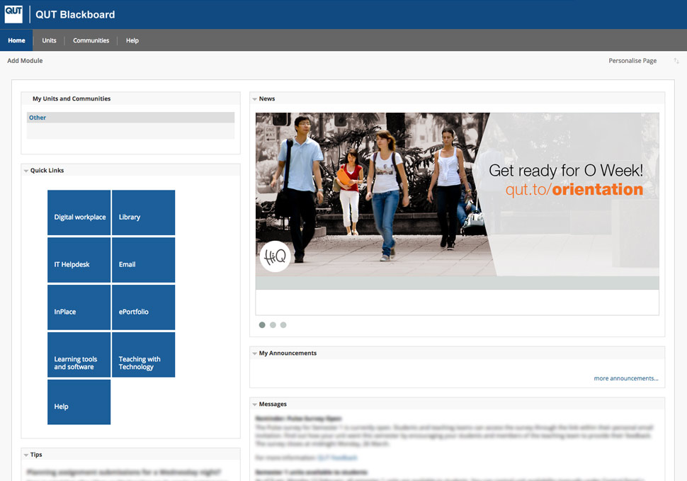
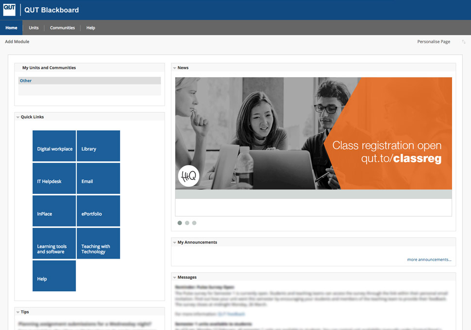
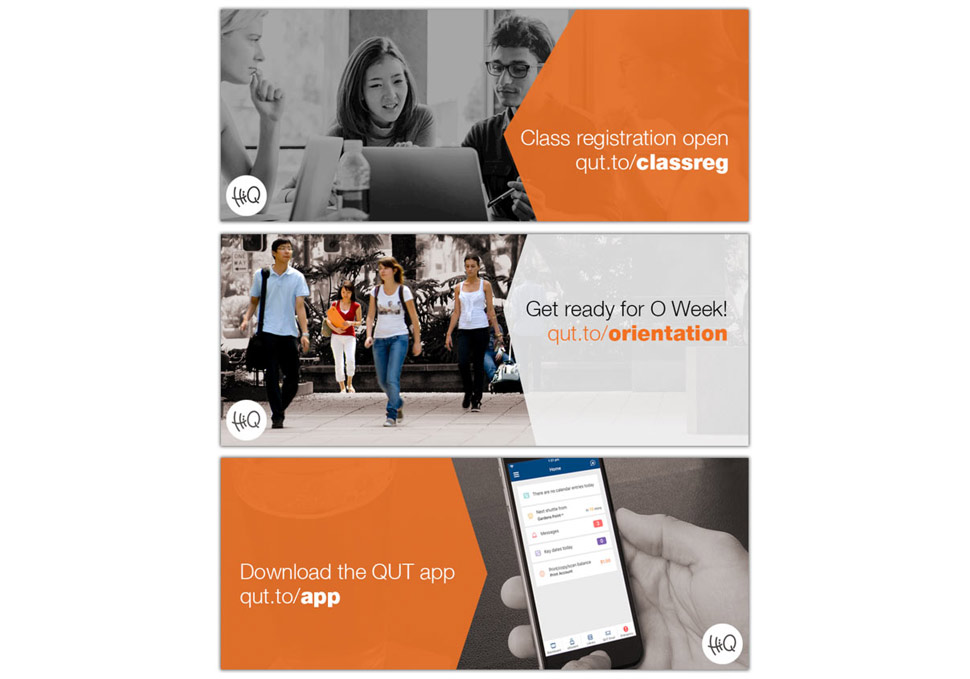
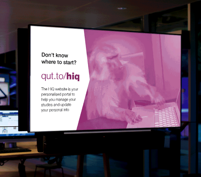
I felt very strongly that digital messaging should use the same typeface as HiQ. Traditionally QUT mixed and matched condensed fonts for digital signage; they were chosen because they squeeze a lot into a small space. It's more effective to use short URLs and limit text than allow too much content to dictate your design choices. Digital signage only displays each slide for 20 seconds, so it's a lot like billlboard advertising because you only have a few seconds to capture the viewer. Many existing files had information spread over 2 pages, which reduces the chance someone will see the message. All of the files I redesigned easily fit key details on one page.
For key HiQ messages I redacted all language to the simplest form. While each message, banner or sign has a similar layout, the graphic elements can feature any image or video as required. This flexibility is key for urgent or unexpected messaging that needs to be displayed quickly.
My proposed digital style was endorsed by the Director, so I implemented it across all HiQ digital channels including the QUT Students site, staff intranet, web banners and all HiQ messaging on digital media.